What Makes an Effective Landing Page That Converts Visitors
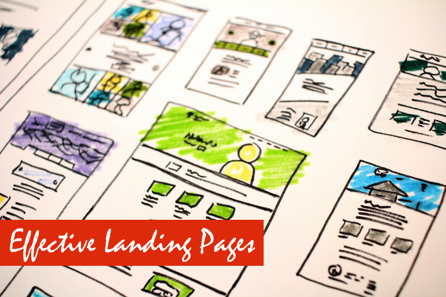
A landing page is more than just a web page - it’s a powerful conversion tool. Whether you’re collecting email addresses, selling a product, or promoting a service, an effective landing page can turn casual visitors into loyal leads or paying customers. Think of it as a digital handshake: it’s your chance to make a strong impression and guide your audience toward a specific action.
In this guide, we’ll break down the essential elements of a high-converting landing page and provide practical tips to help you create one that truly works. We’ll cover everything from goal-setting and headlines to social proof and optimization strategies.
Step 1: Start with a Clear Goal
Before you design your landing page, you need to define its purpose. A landing page without a clear goal is like a map without a destination - you might end up confusing your visitors and losing conversions.
Ask yourself:
- Are you trying to collect email addresses for your newsletter or a free guide?
- Is your goal to sell a product or service directly from the page?
- Do you want to promote a webinar, free trial, or consultation?
Your goal will dictate every design and content decision on the page. For example, a page aimed at collecting emails should emphasize lead magnets and have minimal distractions, whereas a sales-focused page might include detailed product descriptions, pricing tables, and testimonials.
Pro Tip: Write your goal down in a single, clear sentence before you start designing. This simple exercise ensures every element on your page works toward the same objective.
Step 2: Craft a Compelling Headline
The headline is the first thing visitors notice. A weak or unclear headline can make people leave before they even read your page. A strong headline should be clear, concise, and benefit-oriented.
Key points for creating effective headlines:
- Explain what the visitor will get: Be specific about the value of your offer.
- Be easy to read in a few seconds: Use short, simple language.
- Grab attention and spark curiosity: Make visitors want to learn more.
For example, instead of “Sign Up Here,” a more compelling headline could be:
“Get Your Free Guide to Boost Your Online Sales in 7 Days.”
Tip: If your headline addresses a pain point or promise, your conversion rate can increase significantly. Pair it with a subheadline that offers additional context or reassurance.
Step 3: Use Engaging Visuals
Humans are highly visual creatures. Incorporating images, videos, or illustrations can dramatically increase engagement and make your page more memorable. However, visuals should always support your message, not distract from it.
Guidelines for effective visuals:
- High-quality and professional: Grainy or low-resolution images can hurt credibility.
- Fast-loading: Compress images to reduce page load time on both desktop and mobile.
- Relevant: Screenshots, product demos, or lifestyle images that reflect the offer work best.
Tip: If you’re offering a digital product like an eBook, include preview images of the content. Seeing the actual product builds trust and can boost conversions. For services, consider using short testimonial videos to show real results.
Step 4: Highlight Benefits, Not Just Features
Many landing pages make the mistake of focusing solely on features. While features describe what your product or service does, benefits explain why it matters to the visitor.
Ask yourself:
- How does your product or service solve a problem for the user?
- What results or outcomes can they expect?
- Why is your solution better than competitors’ alternatives?
Use short paragraphs, bullet points, and subheadings to make this information easy to scan. For example:
Instead of:
Feature: 50+ templates included
Use:
Benefit: Save hours of design work with 50+ ready-to-use templates
Tip: Speak your visitor’s language. Avoid technical jargon and focus on the transformation or relief your offer provides.
Step 5: Include a Strong Call-to-Action (CTA)
The CTA is the critical element that tells visitors exactly what to do next. Without a clear and compelling CTA, even the best landing page may fail to convert.
Tips for crafting effective CTAs:
- Use action words: Phrases like “Download Now,” “Get Started,” or “Claim Your Free Guide” are direct and motivational.
- Make it visually prominent: Use contrasting colors to make the button stand out.
- Place it strategically: Include it above the fold and repeat it throughout the page if it’s long.
Pro Tip: Limit choices. Multiple competing CTAs can overwhelm visitors and reduce conversions. Focus on one primary action per landing page.
Step 6: Keep Forms Simple
Forms are often the gateway to conversion, but they can also be a source of friction. The more fields you ask visitors to fill out, the less likely they are to complete the form.
Keep it simple:
- For a newsletter, only ask for an email address.
- For a lead magnet, name and email are often sufficient.
- Avoid unnecessary details like phone numbers unless absolutely necessary.
Tip: Use inline validation and clear error messages to reduce frustration. Consider using multi-step forms for longer processes - they feel less overwhelming when broken into smaller steps.
Step 7: Build Trust With Social Proof
Trust is essential. Visitors are more likely to take action if they feel confident about your brand. Social proof is one of the most effective ways to establish credibility quickly.
Consider including:
- Customer testimonials or reviews: Real quotes with names and photos are particularly effective.
- Trust badges or security logos: These are critical for eCommerce pages handling payments.
- Media mentions or certifications: Showcasing recognition from reputable sources can reinforce authority.
Even a few well-placed testimonials can significantly boost conversions. Tip: Rotate testimonials or highlight different aspects of your service to appeal to a wider audience.
Step 8: Test and Optimize
A landing page is never truly “finished.” High-performing pages are the result of ongoing testing and optimization. A/B testing allows you to experiment with different elements to see what drives the best results.
Areas to test:
- Headlines and subheadlines
- CTA text, color, and placement
- Images, videos, or graphics
- Form fields, layout, and length
Use tools like Google Analytics, heatmaps, or specialized landing page software to track conversions and identify weak points. Over time, even small tweaks can lead to significant improvements in performance.
Tip: Focus on testing one variable at a time. Changing too many elements simultaneously can make it difficult to determine which adjustment caused the improvement.
Conclusion
Creating an effective landing page is all about clarity, focus, and user experience. Every element - headline, visuals, benefits, CTA, form, and social proof - should work together to guide visitors toward a single goal. By defining your objective, crafting compelling messaging, using engaging visuals, highlighting benefits, including strong CTAs, keeping forms simple, and building trust, you can turn more visitors into leads or customers.
Remember, even a well-designed landing page can always be improved. Regular testing and optimization ensure that your page performs at its best, helping you grow conversions and achieve your online goals. With attention to detail and a user-first approach, your landing page can become a powerful asset for your business.